If you haven't been to the Netflix homepage recently, then you're one of the few. I was at once one of those few out there that hadn't yet joined the movement that is Netflix. One of the things that kept me from signing up for the longest time was the lack luster, mediocre at best homepage. This is the first page the user experiences. Yet I couldn't help but think, "How could this site that looks like it was developed back in the late 80's, be the thing to bring us the future of movies?"
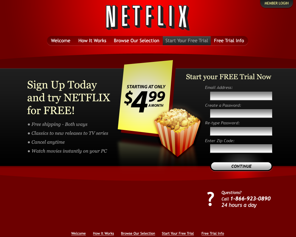
This was the Netflix homepage as it was when I originally did the new concept. I contacted anyone I could at Netflix and showed them the new conceptual redesigned homepage (below). I'm not saying I had any kind of influence, but it's an awful coincidence that the homepage has since changed to a slightly nicer looking "design".
I went ahead and took the dive into the unknown and became a member of Netflix despite my reservations about how technologically sound and quality such a poor design could be. Once I was in I was hooked and quickly moved from 1 to 3 movies out at a time, streamed any and all Doctor Who I could get, and became a big fan of the service Netflix offers.
All that said, I still felt like the design was done as more of a working, developer design (nothing against developer, after all I'm one too), rather than a real quality, usable, and astheticly pleasing design. I thought it could be better, so here's what I put together for a new homepage design.
With this design I've incorporated everything in the current site, minus the bland, ugly, dated design. Right away the user knows what this site offers, movies. The color scheme works off of the Netflix red and provides a much richer, touchable look. The new design keeps everything the user needs to have quick access to on the homepage, and removes the clutter and the harshness of the bright red used in the current background.
In closing, we at BeOriginal think Netflix offers a great service that keeps getting better. The current design really doesn't show the quality, nor get the turnover that they deserve as a great company providing a very current, high quality, and tech related service. A new, updated, "web 2.0-ish" design could drastically improve the new user growth, as well as the current user moral and organic spread.